What Can Claude Actually See?
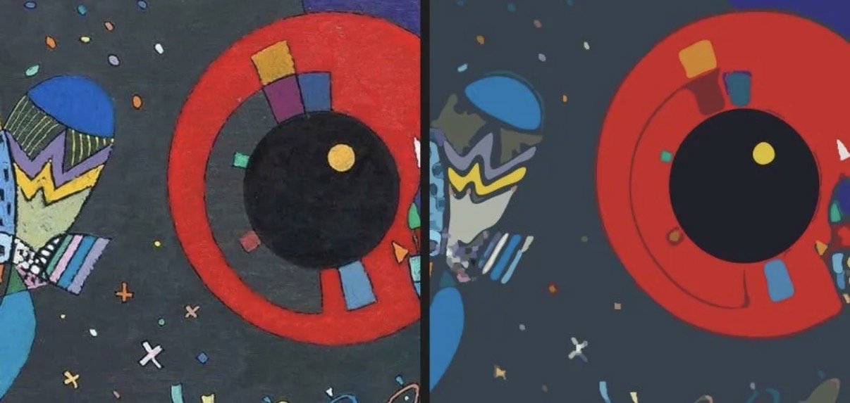
In the last post, I described how 31 iterations of Claude Opus visually interpreting a Kandinsky painting produced a worse SVG than one pass of a data-driven pipeline. The conclusion was clear: don't trust the AI's visual interpretation — trust the pixels.
But that raised a question I couldn't leave alone: what, specifically, can Claude see and what can't it see? Not as a philosophical inquiry — as a practical measurement exercise. If I could map the blindspots precisely, I could build tools to compensate for them.
The Gray Semicircle That Started It
During the Kandinsky SVG session, I spent half the time trying to convince Opus that a gray semicircle existed between the red ring and the black center of the painting. It kept rendering just an outline where there was clearly a filled shape. I could see it. Opus could not — or rather, it could see something, but not reliably enough to reproduce it.
That's when the hypothesis formed: Claude doesn't have human vision. Obviously. But how is it different? Where are the thresholds? What can it see that we can't, and vice versa?
The Diagnostic
I had Claude generate test images with known ground truth — programmatic images where every pixel value was deliberate and recorded. Then I had it look at those images and answer questions about what it could see, scoring against the ground truth. Four rounds, 120+ individual tests.
v1: Basic Capabilities
Low-contrast discrimination, color identification, element counting, gradient detection, shape identification, texture, spatial precision, and fine detail. This established the baseline numbers.
v2: Real-World Tasks
OCR at various sizes and degradation levels, UI element recognition, chart and table reading, photographic nuance (shadows, specular highlights, depth of field), and compression artifact detection.
v3: Classic Illusions
Adelson's checker shadow, Cornsweet, simultaneous contrast, White's illusion, Mach bands, Hermann grid — and a recreation of the Dress phenomenon with controlled backgrounds. Also repeated the low-contrast tests across light, medium, and dark backgrounds.
v4: Complex Scenarios
Transparency and alpha compositing, scale comprehension, perspective reasoning, chart and graph reading (line, bar, pie, scatter, heatmap, stacked area), and annotated screenshot parsing.
What It Found
The Hard Limits
| Blindspot | Measured Threshold | Practical Impact |
|---|---|---|
| Luminance contrast | ~15–20 RGB steps | Faint shapes on similar backgrounds vanish |
| Gradient detection | <30-step range invisible | Subtle gradients reported as flat fills |
| Element counting | Degrades above 15; ~50% error at 30 | Can't reliably count dense collections |
| Fine elements | <15px effectively invisible | Small details need zooming |
| Subtle atmospherics | <10 RGB units of shift | Steam, faint reflections lost in noise |
The contrast threshold is the big one. A 7-step RGB difference (say, 40 to 47) is completely invisible. A 15-step difference is borderline. A 30-step difference is reliable. This held across all three background luminances tested, meaning it's not a dark-mode problem — it's a universal resolution limit in the visual encoding.
Interestingly, hue sensitivity is dramatically better than luminance sensitivity. A 15-unit hue shift (same total delta that was invisible as a luminance shift) was detected clearly. Claude's vision is more sensitive to color than to brightness.

The Dress Effect
This was the fun part. I recreated the Dress illusion principle: identical stripe colors placed on three different backgrounds simulating blue ambient light, warm ambient light, and neutral conditions.
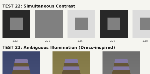
Claude is susceptible. The same pixel values looked "lavender and gold" on the blue background and "purple-blue and dark brown" on the warm background. This matches the human pattern — the visual system infers the illumination source and compensates, producing different color percepts from identical input.
The Split With Humans
Here's where it gets interesting. Claude is susceptible to high-level, contextual illusions — the Dress effect, Adelson's checker shadow, Cornsweet, simultaneous contrast. These are all cognitive: they involve inferring light sources, scene structure, material properties.
But it's not susceptible to low-level, retinal illusions — no Mach bands (edge enhancement at luminance boundaries), no Hermann grid phantom dots (lateral inhibition artifacts). These are physiological effects that happen in the retina before the signal even reaches the visual cortex.
This makes perfect sense. Claude doesn't have a retina. Its visual processing is entirely learned/cognitive, not physiological. It has the high-level biases (illumination inference, context effects) without the low-level artifacts (lateral inhibition, center-surround antagonism).
Surprising Strengths
OCR was nearly flawless — 7/7 clean text at all sizes and styles, 8/8 special characters including diacritics and math symbols, readable through blur, rotation, low contrast, dark-on-dark, and even overlapping text layers. The only failure was extreme 4× downsampled pixelation.
Chart reading was strong across line, bar, pie, scatter, heatmap, and stacked area charts — including detecting truncated y-axes and reading all annotations. UI screenshots, form fields, and annotated mockups were parsed perfectly including special characters like Ø and ü.
Spatial precision was 4/4 on grid positioning. 3D interpretation (light direction, specular highlights, depth of field) was solid. Transparency layers were correctly decomposed with reasonable opacity estimates.
From Diagnosis to Treatment
With a blindspot map in hand, the compensatory tools write themselves. Each tool targets a specific measured weakness:
| Blindspot | Tool | What It Does |
|---|---|---|
| Luminance contrast | enhance, sample | Stretch histogram, report exact RGB |
| Context color bias | isolate, sample | Extract region onto neutral background |
| Invisible gradients | gradient_map | Amplified local gradient visualization |
| Small elements | crop (with zoom) | Nearest-neighbor upscale for inspection |
| Dense counting | count_elements | Connected component analysis |
| Noise-masked features | denoise | Median filter reveals hidden signal |
| Attention overload | grid | Splits image into labeled cells |
| Shape boundaries | edges | Sobel edge detection for invisible borders |
| Color ground truth | palette, histogram | K-means extraction, value distribution |
The full skill is 12 functions in a single Python file, zero dependencies beyond Pillow. Every function runs in under a second. The workflow is: grid first (reduce attentional competition), then targeted analysis of regions of interest.
Validation: The Gray Semicircle
Testing the tools on the original Kandinsky image that started all of this:
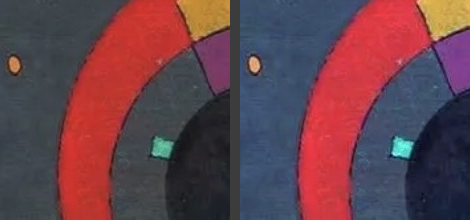
enhance(auto) — auto-levels make the gray band unmistakable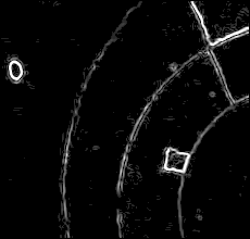
edges(threshold=30) — the semicircle boundary is the second arc from outsideThe sample tool pinpointed the semicircle's color at RGB(109, 61, 99) — a muted purple-gray, not the neutral gray I'd been assuming. The edges output shows its boundary as a clear arc between the red ring and black center. No ambiguity. No 31 iterations of persuasion needed.
Closing the Loop
The previous post argued: trust the data, not your imagination. This post is the complementary move: measure the imagination first, then augment it with data.
The image-to-svg skill replaced visual interpretation with a computational pipeline. The seeing-images skill keeps the visual interpretation but gives it verification tools calibrated to its specific blindspots. Both approaches work because they're grounded in the same principle: know where the model fails, then route around those failures.
The diagnostic images and ground truth data are in the conversation artifacts. If you want to run your own vision tests on Claude (or another model), the methodology is straightforward: generate test images with known pixel values, have the model report what it sees, score against truth. The blindspot profile you get is the spec sheet for whatever compensatory tools you build.
Claude has a different visual system than we do. Not worse — different. It can't see a 15-step luminance gradient, but it can read 5-pixel text and parse overlapping transparent layers. It's fooled by the Dress illusion but immune to the Hermann grid. Once you know the shape of those differences, you can work with them instead of fighting them.